Data-Driven Design for Smarter Editorial Operations
Overview
Translated Complex Editorial Needs into Clear, Actionable UI
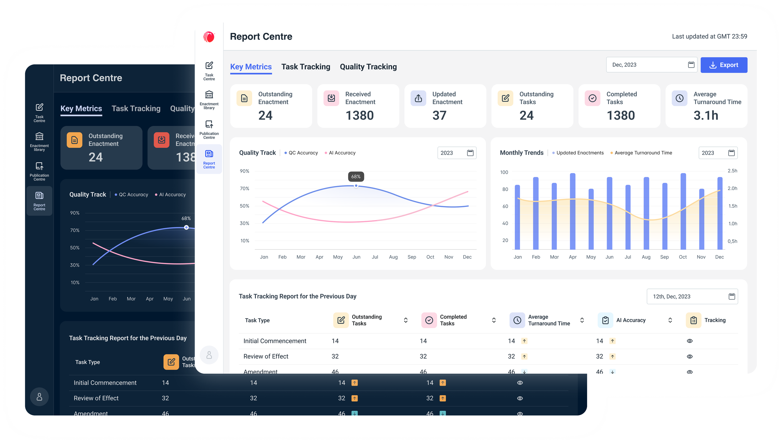
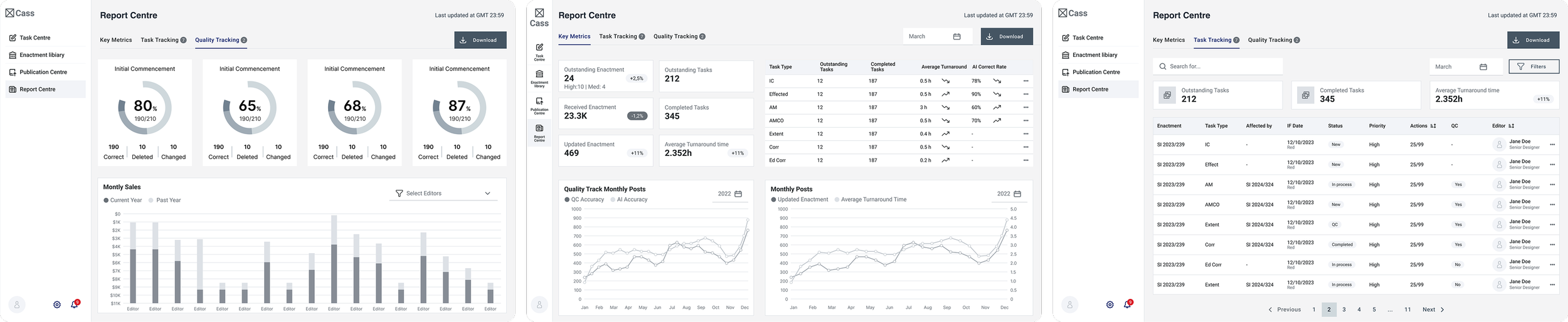
Faced with a dense, non-design-native brief from editorial managers, I extracted core requirements and transformed them into intuitive interface concepts. The original request focused on metrics and reporting—but lacked any UX framing. I bridged that gap, designing clear visual hierarchies and interactive data views tailored for non-technical users.
Discovery
Card Sorting: Making Sense of Messy Editorial Logic
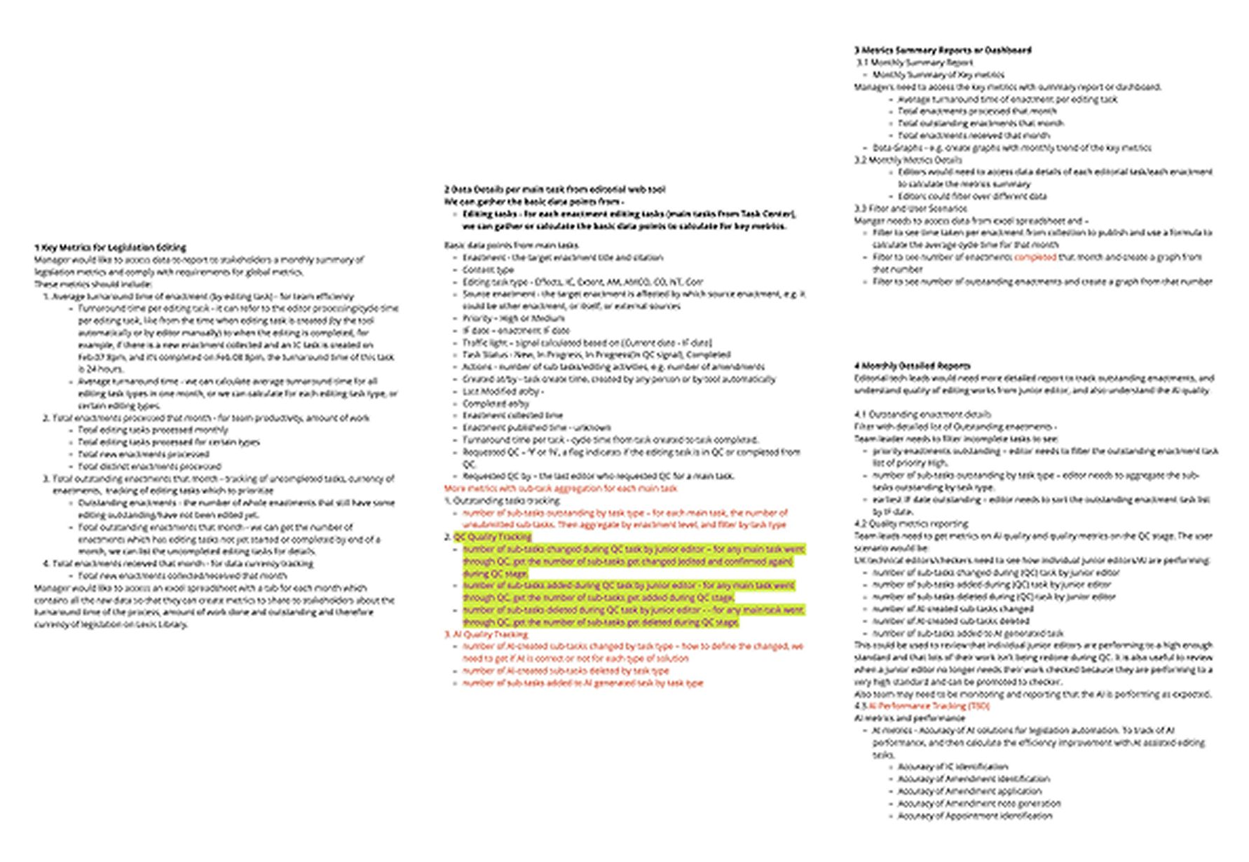
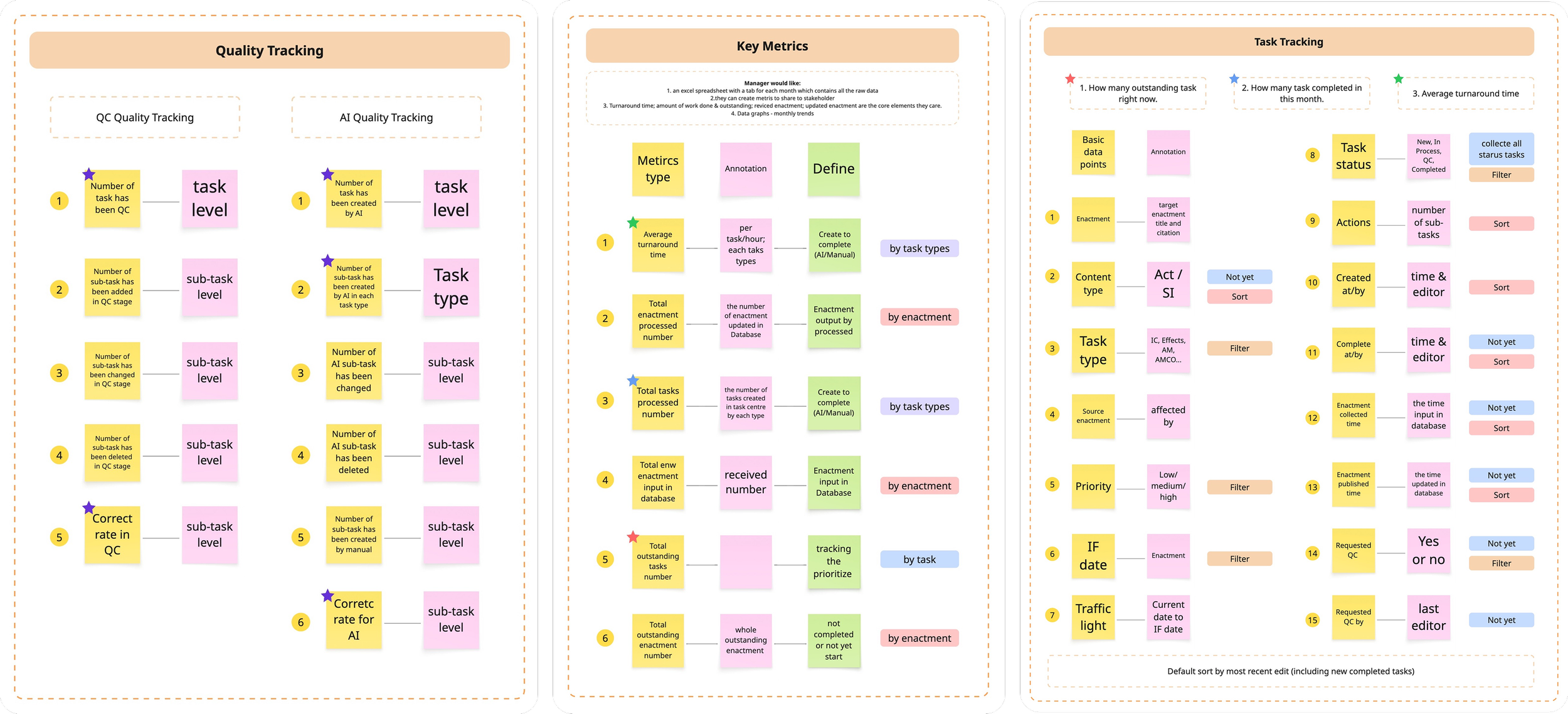
To untangle the complex editorial logic, I ran card sorting sessions to reorganize raw metric requests into clear, user-centered categories. This process helped bridge the gap between operational thinking and intuitive UI structure.
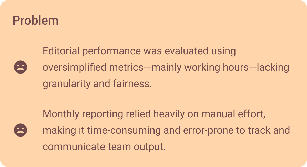
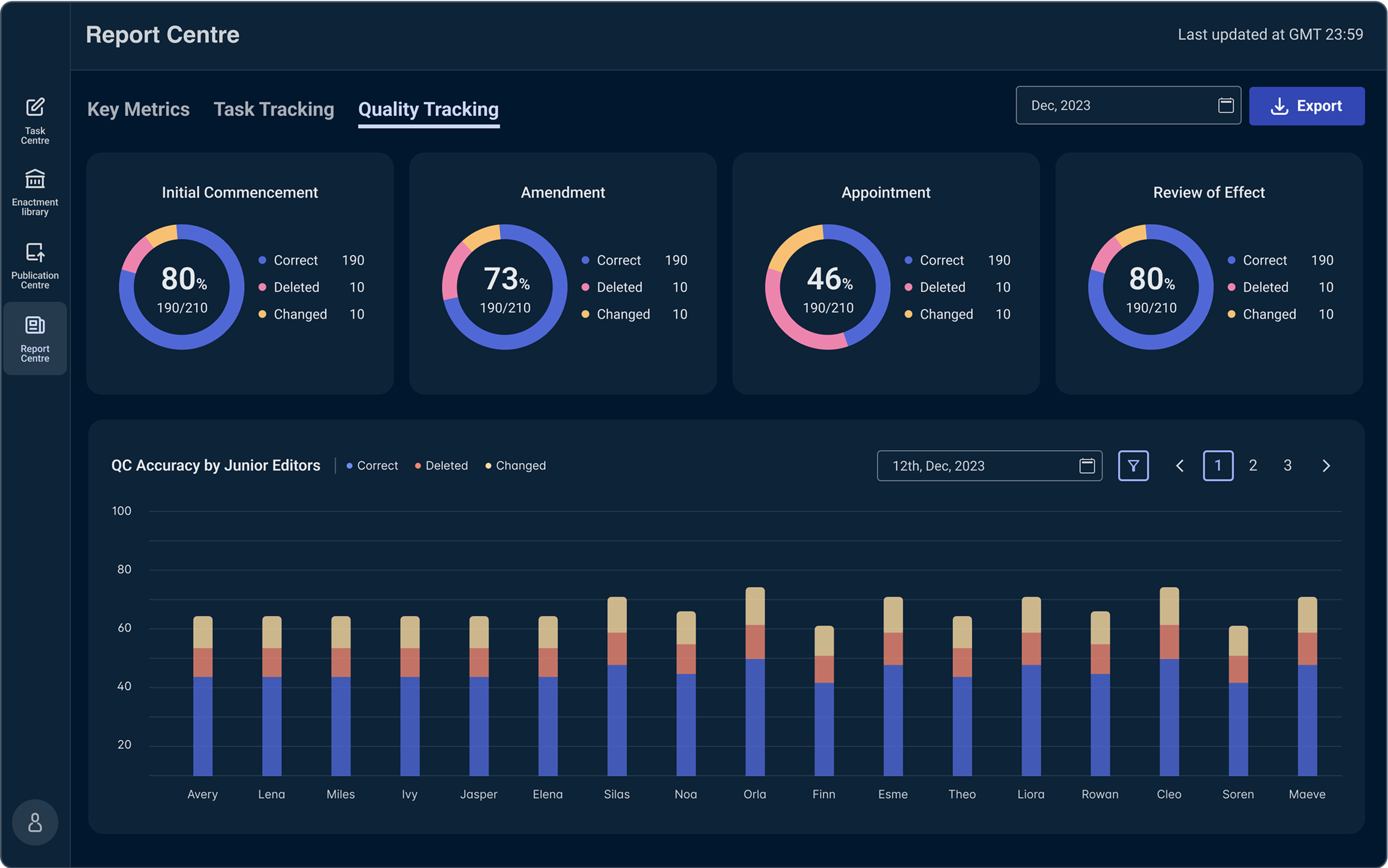
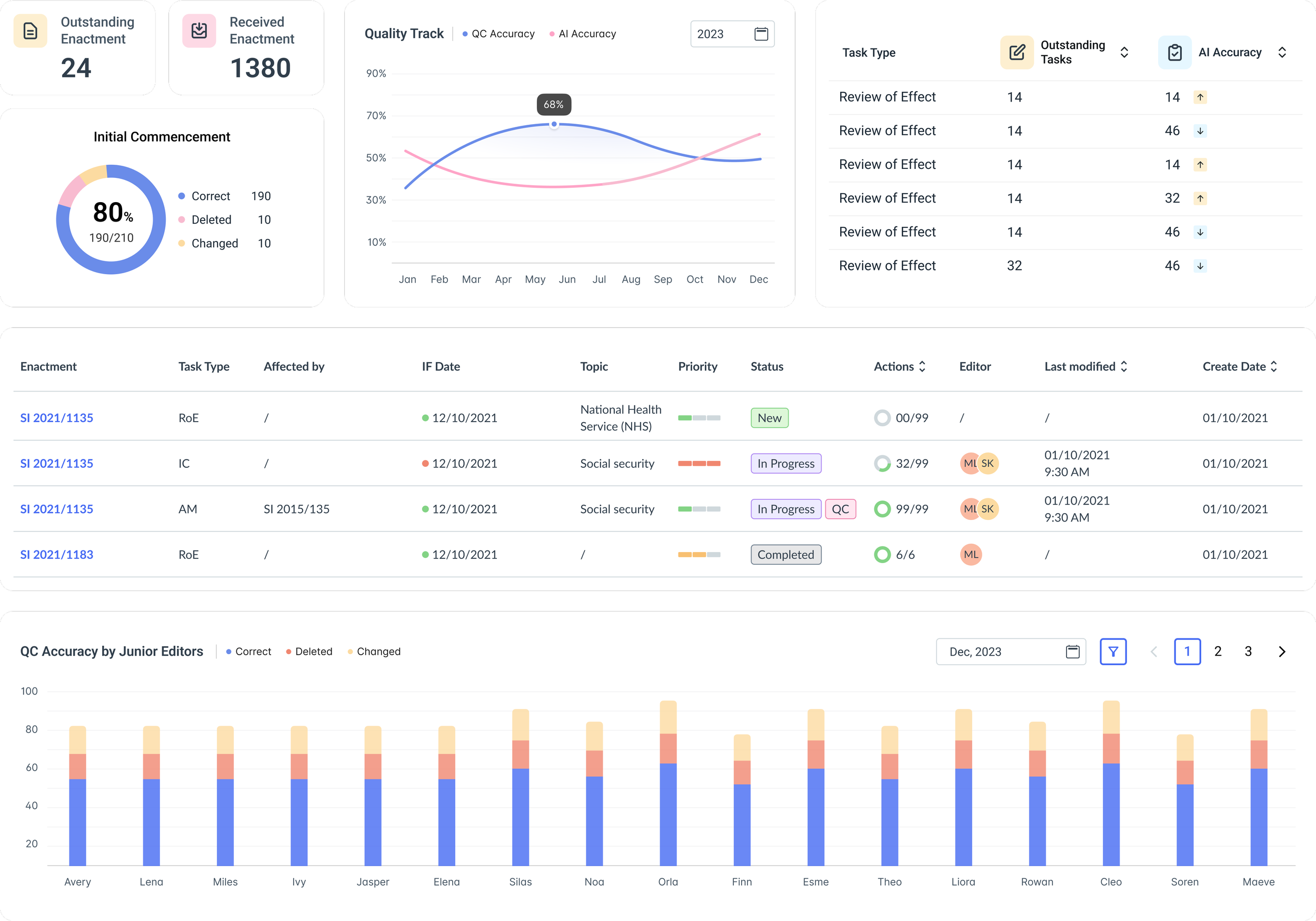
Problem & Goal
Low-Fi Expropriations
In the early exploration phase, I experimented with ways to merge fragmented datasets, test different visualization styles, and evaluate layout strategies for presenting complex metrics clearly and effectively.
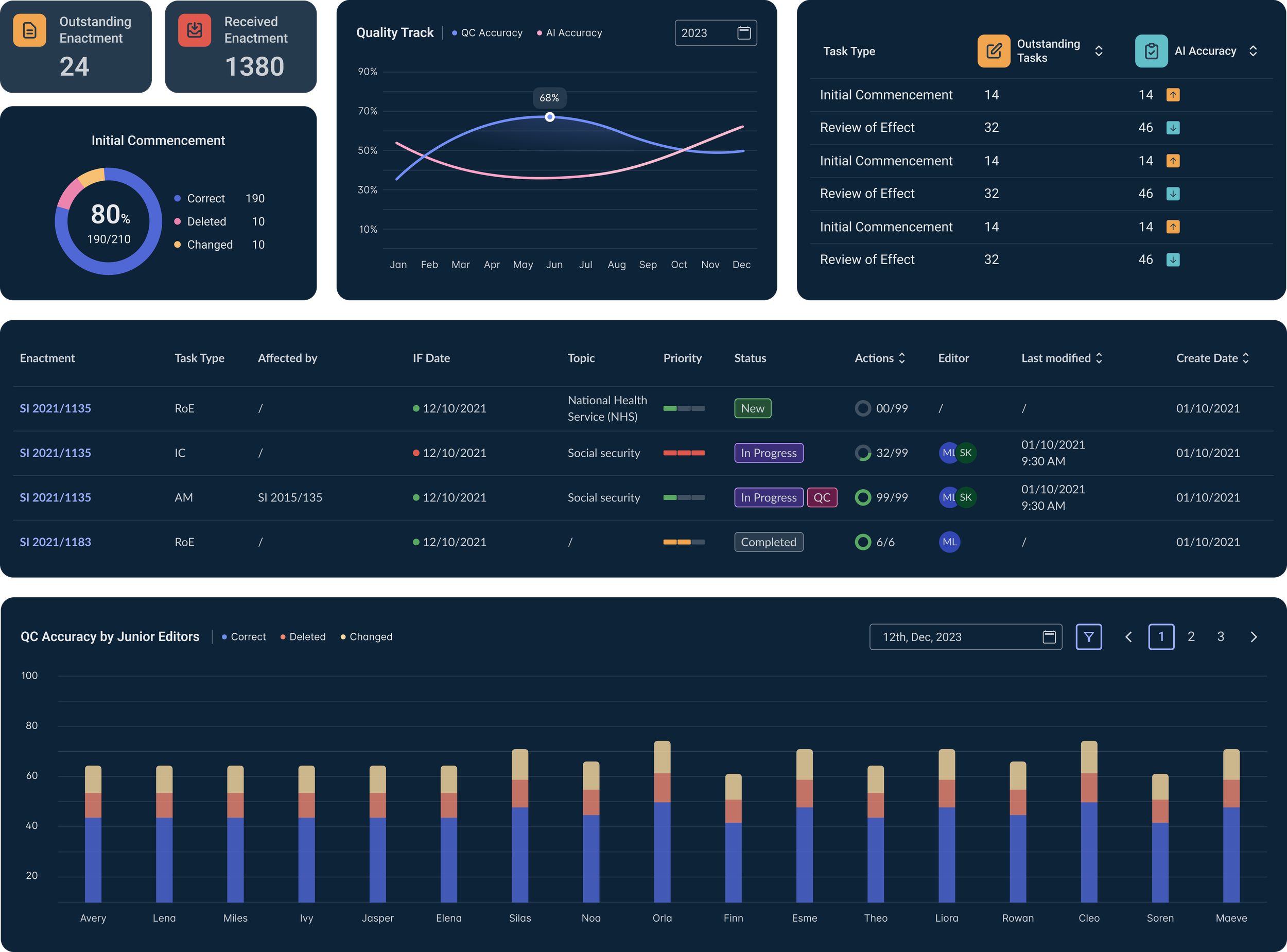
Light & Dark Themes
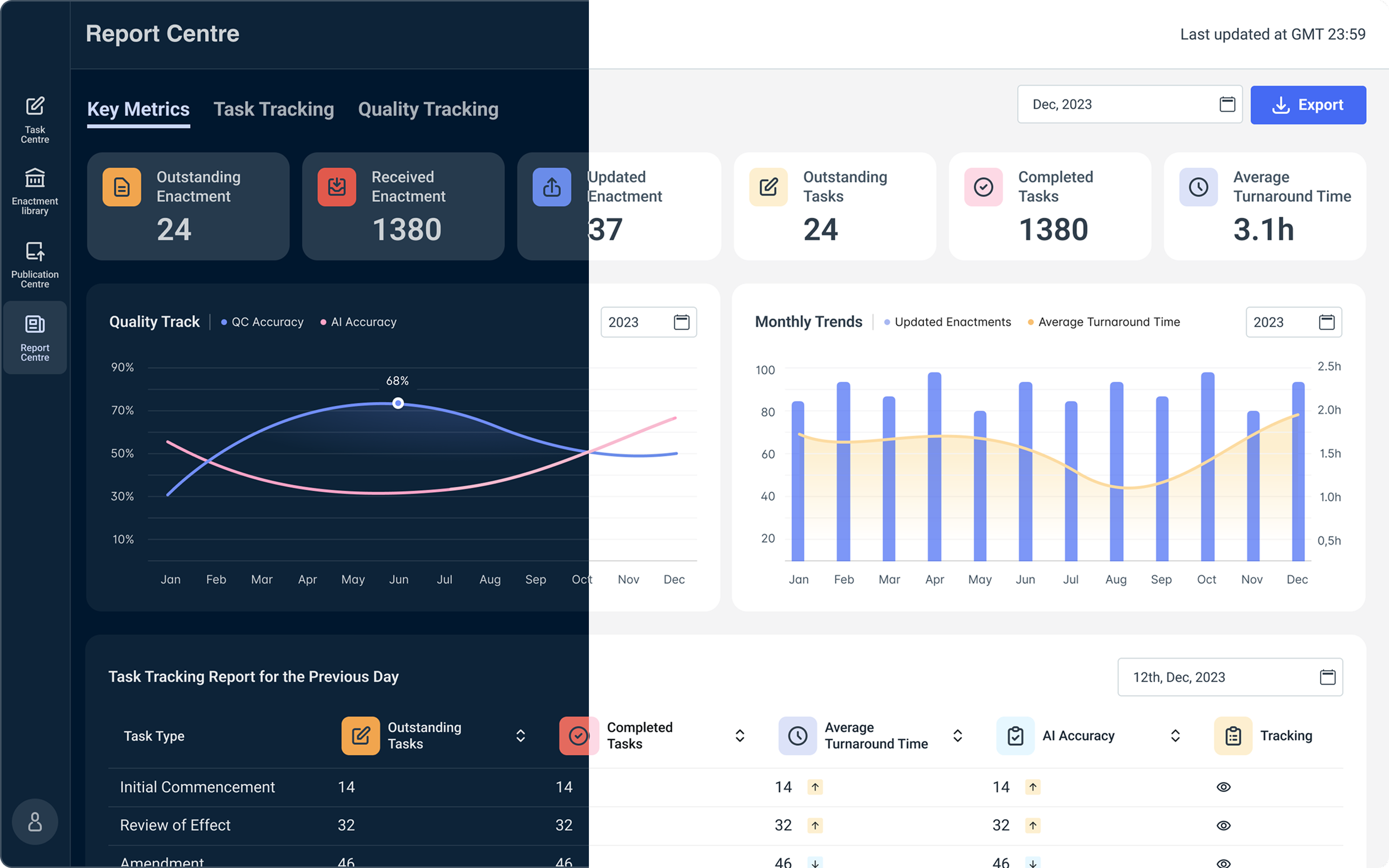


Design System Extend
To ensure long-term scalability, I refined the design system with new data-specific components and layout patterns. This not only improved visual consistency but also accelerated future dashboard iterations across teams.
Takeways
This project marked my first time designing for dark theme, which taught me how to adapt visual hierarchies, contrast, and accessibility across themes.
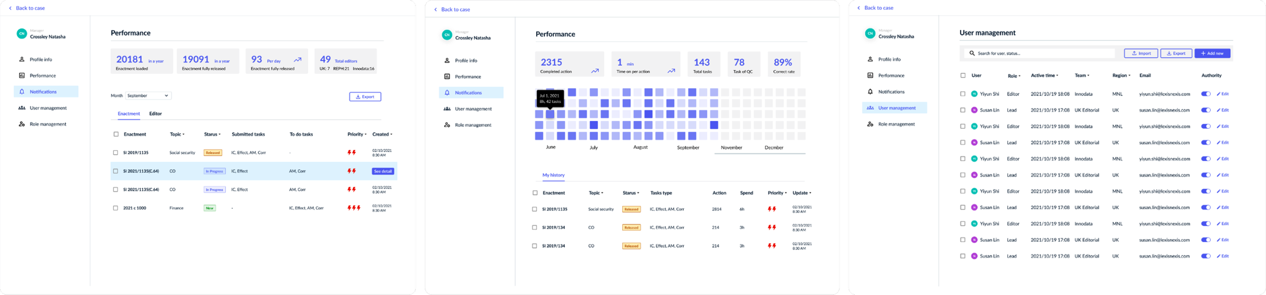
I often stepped beyond design tasks to support the PO, helping define user roles and permission logic when requirements were unclear. This experience strengthened my confidence as a product-minded designer who bridges UX, UI, and strategy.